ShopDreamUp AI ArtDreamUp

Deviation Actions


Suggested Deviants


Suggested Collections


You Might Like…


Featured in Groups


Comments27
Join the community to add your comment. Already a deviant? Log In
Hi there! I’m here from Project Comment 
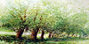
I found this deviation through the weekly commenting project and I must say, that is a really interesting piece of art. The colors are great and so wonderfull. A lage variation of grey and red, beautifull. When I watch this I am feeling like I am in vacation and that the best part on an artwork: it haves a meaning. ( and I must say I need a vacation ). From the colors it looks so happy and a nice place where you can go. It would be also better if you ling the reference in the description. I googled some images of it and I foung some churches, but I don't know which you've painted.
From the tehnical part, I've saw that you are really good on watercolor painting, but I must say some things like:
- the green and yellow, blue and black art is the rooth? it looks a little bit disproportiond ( Crooked ).
- if you use darker colors in the distance, it would have a nicer three dimensional effect. But put the darker colors gradual
- and I saw on the right part ( under the corner ) some white paper parts. I would sugesst you to paing all the paper, or , if you want the withe part, you can use tape as a frame ( apply it before painting, and remove it when it's done)
Anyway great deviaion, you're a talented person. Keep working and have an amazin day!
I found this deviation through the weekly commenting project and I must say, that is a really interesting piece of art. The colors are great and so wonderfull. A lage variation of grey and red, beautifull. When I watch this I am feeling like I am in vacation and that the best part on an artwork: it haves a meaning. ( and I must say I need a vacation
From the tehnical part, I've saw that you are really good on watercolor painting, but I must say some things like:
- the green and yellow, blue and black art is the rooth? it looks a little bit disproportiond ( Crooked ).
- if you use darker colors in the distance, it would have a nicer three dimensional effect. But put the darker colors gradual
- and I saw on the right part ( under the corner ) some white paper parts. I would sugesst you to paing all the paper, or , if you want the withe part, you can use tape as a frame ( apply it before painting, and remove it when it's done)
Anyway great deviaion, you're a talented person. Keep working and have an amazin day!